Car Infotainment System
A reimagined car infotainment system that is safer and more efficient for the driver.
Role:
Researcher and designer
Category:
Vehicles
When:
2 weeks, April 2022
Why:
Course project
What:
Car infotainment system
Where:
Vancouver, Canada
Why I made this project
This project was part of the UX unit of my graphic design course. This project was interesting as I was challenged to consider good user experience beyond phone, tablet, and desktop devices. Having a high-standard user experience on a car infotainment system is crucial, as driving safety is a top priority. The car infotainment system provides information, controls, and entertainment to the driver in the vehicle. The drivers' safety was considered during all stages of the design process.


The problem
There is a constant need to improve driver and road safety. Car infotainment systems are essential in modern vehicles for their useful functionalities such as navigation and communication. However, they often carry the risk of distracting the driver for too long with slow response times, complex interfaces, and too much information.
The claim
The issue of driver and road safety involves constant evaluation and improvement. The car infotainment system is a complex interface placed at the center of a car's dashboard and includes several functionalities such as navigation, entertainment, climate control, and more. Studies find that vehicle voice and touchscreen technology can distract drivers for over 40 seconds. This raises substantial safety concerns as drivers take their eyes off the road or are distracted for long durations.
Initial research shows
Initial research illustrates that there is a need in the market for a car infotainment system which reduces distraction time and increases driver safety on the road.

Usability testing + Feedback iteration
Many designs go through several iterations based on user feedback on the product. I created a user test for the redesigned infotainment system and the feedback I received helped me iterate my design and improve the user experience.
Based on the survey and the usability test, the feedback was as follows:
-
There should be an additional <home> button which redirects right back to the homepage.
-
There was some confusion on whether the <back> button was the only route to reach the homepage again.


User flow
To outline the functionality of the redesigned car dashboard system, I created a simple and streamlined user flow diagram. The user flow aided me in understanding the user's journey from the first interaction to the last. The user flow diagram was beneficial in visualizing the user experience at each screen state to ensure I met the users' goals at each stage.
Examples of user goals being met during different screens of a car infotainment system:
-
Users can easily listen to quality audio to make their journey more enjoyable.
-
Easy navigation to get from point A to B easily.
-
Safely call or message people without taking eyes off the road.

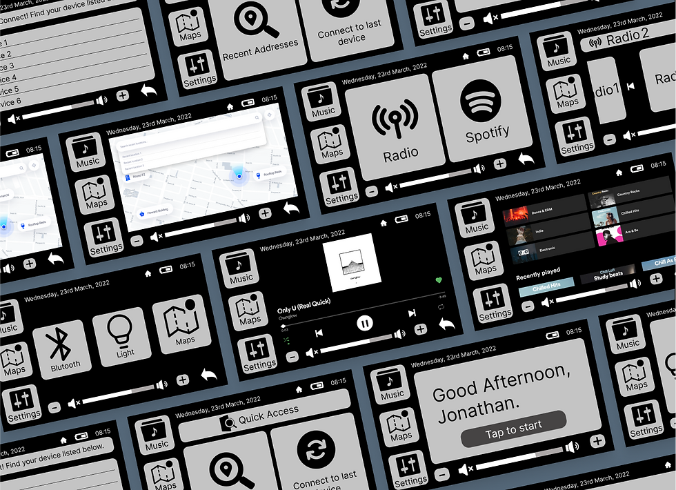
Low-fidelity wireframes
Once the user flow was established, I created low-fidelity wireframes of the primary user flow. This guided my design process when creating the mid-fidelity prototype and screens and later will drive the high-fidelity prototype.
_heic.png)
Mid-fidelity prototype
For this particular project, due to time constraints, we were only assigned to create mid-fidelity wireframes. If I had more time, I would include proper branding and powerful UI further to enhance the usability of the car infotainment system.

Key takeaways from the survey


User survey
I conducted an online survey via Useberry on individuals who drive, and 8 participants responded.
Conducting user surveys was essential to gather responses quickly. The data collected from the surveys provided a general understanding of user opinions regarding car infotainment systems.
The link to the survey responses can be found here.
Key takeaways from the responses:
-
Almost all participants drive their cars daily and use their infotainment system to perform other tasks like getting directions or listening to music via a streaming platform, radio, or Bluetooth.
-
The car dashboard interface should be optimized to not distract the driver from completing their journey safely. They should be able to easily navigate the interface without spending too much time on it.
Reverse ideation
In this instance, reverse ideation was beneficial to highlight negative aspects and risks related to the car infotainment system.
The main takeaways from my customer journey map were:
-
Using iconography as it is a clearer visual cue than text for the user.
-
Providing information on the available radio stations for ease of use.
-
Having maps pre-populated with the user's location.

Personas
I created a persona based on a type of user for this app:
About Jon
Jon Smith is a 28-year-old bank clerk who lives in the city with his girlfriend. He commutes to work every day and spends a lot of time in his car traveling between work, home, and running errands. Jon is not particularly tech-savvy and finds the infotainment system in his car to be overwhelming, often struggling to navigate the different features while driving. He primarily uses the system for listening to music during his commute, and would like a high-quality sound system that can play his favorite playlists without any glitches or interruptions.
Goals
-
Needs clear and intuitive controls that don't distract from the road. This will increase focus while driving and ensure Jon is getting home quickly after a long day at work.
-
Prefers a streamlined interface that doesn't overwhelm in complexity or with information.
-
Values safety and wants to minimize distractions while driving
-
Jon is a music nerd and wants a high-quality sound system for listening to her favorite playlists.
Frustrations
-
Current car infotainment system is too complex to use.
-
No time to spend learning new and uncommon features as job is too demanding and Jon is too tired to bother during the week.
-
Not confident enough to try new features when actually driving - too risky.
-
Using program navigation or searching for a specific song while driving makes Jon feel unsafe.
-
Very frustrating when the infotaintent system takes a long time to load.

Age: 28 🤘🏼
Education: Baws Business School
Hometown: Vancouver, Canada
Car: Most recent Toyota Prius model